See this post to learn about using charts
We can use tabular data (ie the information in a spreadsheet) to produce highly visual charts to assimilate and explain our data

ACTIVITY
EX 1*EX 2EX 3*EX 4*EX 5*EX 6*EX 7EX 8DOWNLOAD
- make a new spreadsheet: Survey Results
- below is the data from your survey
- select the cells that you want to include in your chart (eg A1 to E8)
Click Insert >> Chart - choose a chart style
| Rating | Survey results |
|---|---|
| Very dissatisfied | 12 |
| Dissatisfied | 23 |
| Neutral | 53 |
| Satisfied | 118 |
| Very satisfied | 94 |
- make a new spreadsheet: Web traffic
- below is your data
- select the cells that you want to include in your chart (eg A1 to E8)
Click Insert >> Chart - choose a chart style
| Source | Percentage |
|---|---|
| Organic search | 29% |
| Direct | 23% |
| Referral | 20% |
| Paid search | 17% |
| Social | 11% |
- make a new spreadsheet: Annual Home Sales
- below is the data for the sales
- select the cells that you want to include in your chart (eg A1 to D6)
Click Insert >> Chart - choose a chart style
| Year | New Builds | Existing |
|---|---|---|
| 2014 | 213,933 | 123,345 |
| 2015 | 196,334 | 145,899 |
| 2016 | 218,986 | 189,000 |
| 2017 | 355,698 | 200,433 |
| 2018 | 415,320 | 340,210 |
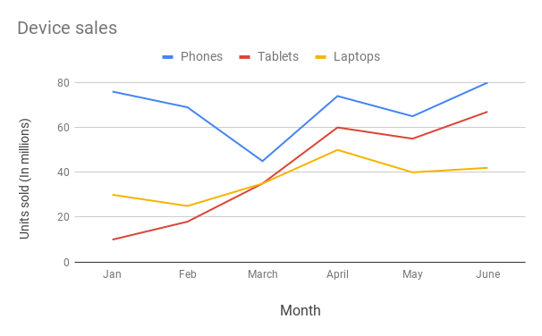
- make a new spreadsheet: Monthly device sales
- below is the data for your sales
- select the cells that you want to include in your chart (eg A1 to E8)
Click Insert >> Chart - choose a chart style
| Month | Phones | Tablets | Laptops |
|---|---|---|---|
| Jan | 76 | 10 | 30 |
| Feb | 69 | 18 | 25 |
| March | 45 | 35 | 35 |
| April | 74 | 60 | 50 |
| May | 65 | 55 | 40 |
| June | 80 | 67 | 42 |
- make a new spreadsheet: Grades
- select the cells that you want to include in your chart (eg A1 to E8)
- Insert your chart
- choose a chart style
| Marks | Juniors | Seniors |
|---|---|---|
| A | 14 | 28 |
| B | 26 | 34 |
| C | 35 | 30 |
| D | 30 | 5 |
| F | 20 | 15 |
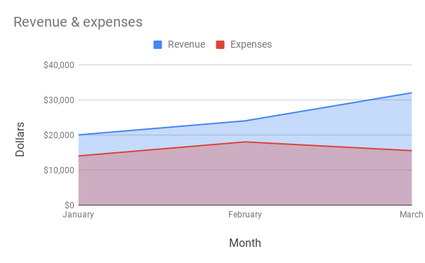
- make a new spreadsheet: Trading
- select the cells that you want to include in your chart (eg A1 to E8)
- Insert your chart
- choose a chart style
| Month | Revenue | Expenses |
|---|---|---|
| January | £20,000 | £14,000 |
| February | £35,000 | £18,000 |
| March | £32,000 | £15,500 |
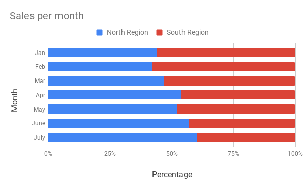
- make a new spreadsheet: Sales per month
- select the cells that you want to include in your chart (eg A1 to E8)
- Insert your chart
- choose a chart style
| Month | North region | South region |
|---|---|---|
| Jan | 44% | 56% |
| Feb | 42% | 58% |
| Mar | 47% | 53% |
| Apr | 54% | 46% |
| May | 52% | 48% |
| June | 57% | 43% |
| July | 60% | 40% |
- make a new spreadsheet: Class size
- select the cells that you want to include in your chart (eg A1 to E8)
- Insert your chart
- choose a chart style
| School/University | First-year undergraduate | Second-year undergraduate | Third-year undergraduate | Fourth-year undergraduate |
|---|---|---|---|---|
| University A | 5,425 | 6,251 | 3,650 | 4575 |
| University B | 3,550 | 4,580 | 4,400 | 4100 |
| University C | 4,800 | 5,250 | 3,850 | 3600 |
If this opens in Google Sheets, download as Excel
Advanced
INFOEX AEX BEX CEX DEX E
Having obtained the data above, we can now do some analysis on that data
NOTE:
- make sure you use the correct format for the numbers (eg %, £ etc)
- the table is visually appealing
- open: Annual Home Sales
- add a column: Average
- insert a formula to calculate the average number of new builds 2014-18
- this needs to be repeated on every row (same answer each time)
- create a new chart that shows all the data
- place it next to your previous chart
- choose a chart style
- open: Monthly device sales
- add a column: Total Sales
- insert a formula to calculate the total sales each month
- add a row at the bottom: Average
- insert a formula to calculate the average number of sales for each device
- create a new chart that shows all the data
- place it next to your previous chart
- choose a chart style
- open: Survey Results
- make a copy of Survey Results
- call it Survey Analysis
- show the total of all the responses
- add a column: %
- insert a formula to calculate the percentage of each response
- create a new chart that shows all the data
- place it next to your previous chart
- choose a chart style
- create the chart title and axis labels
- create a legend
- open: Grades
- make a copy of Grades
- call it Grades Analysis
- show the total of all the grades
- add a column: % for juniors and seniors
- insert a formula to calculate the percentage of each grade
- create a new chart that shows all the data
- place it next to your previous chart
- choose a chart style
- create the chart title and axis labels
- create a legend
- open: Trading
- download the spreadsheet as an Excel document
- show the total of Revenue and Expenses
- show the Profit for each month (Revenue – Expenses)
- show the total profit
- create a new chart that shows all the data
- place it next to your previous chart
- choose a chart style
- create the chart title and axis labels
- create a legend